Beauty packaging and design is your first opportunity to make a statement as a brand.
At its best, beauty packaging is unique, visually arresting – sometimes even provocative – environmentally-friendly and simple (or, even better, also fun) to use.
Here are a few standout examples of packaging and product design from brands in the past year and why we love them.
Tickets for this year's Pure Beauty Awards are now on sale. Don't miss out on the biggest night in the beauty industry calendar. Buy your tickets here.
1. Head & Shoulders, Bare
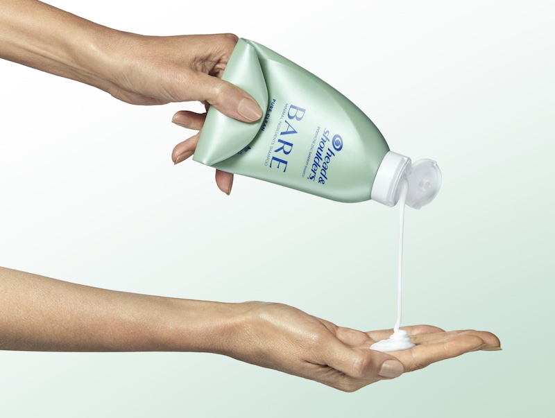
This May, Procter & Gamble-owned hair care brand Head & Shoulders launched an anti-dandruff shampoo called Bare. As well as an industry-first formulation made using only nine ingredients, Bare comes in a fully-recyclable bottle that can also be rolled and squeezed. Its design makes it easier for consumers to use the entire contents of the product and avoid waste.
2. Isamaya Ffrench, Lips
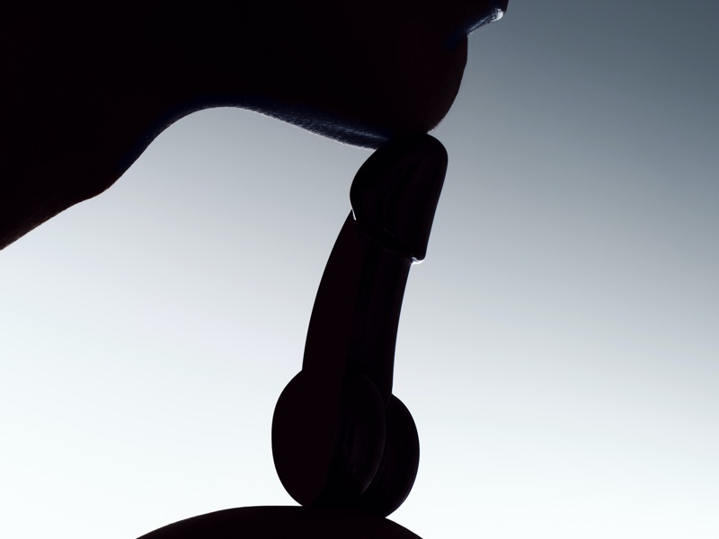
Isamaya, the make-up brand from MUA Isamaya Ffrench, shocked the beauty world earlier this year when it launched a new line of lipsticks in phallic packaging. The gunmetal packs are said to have been inspired by the ‘post-Italian Renaissance male form’ and their taboo silhouette is on-brand for Ffrench. Her debut collection incorporated fetish themes, with product names like Belt, Flesh and Whip, while the brand’s newly-launched campaign featuring actress Julia Fox is BDSM-inspired.
3. Zara, Mini Artists
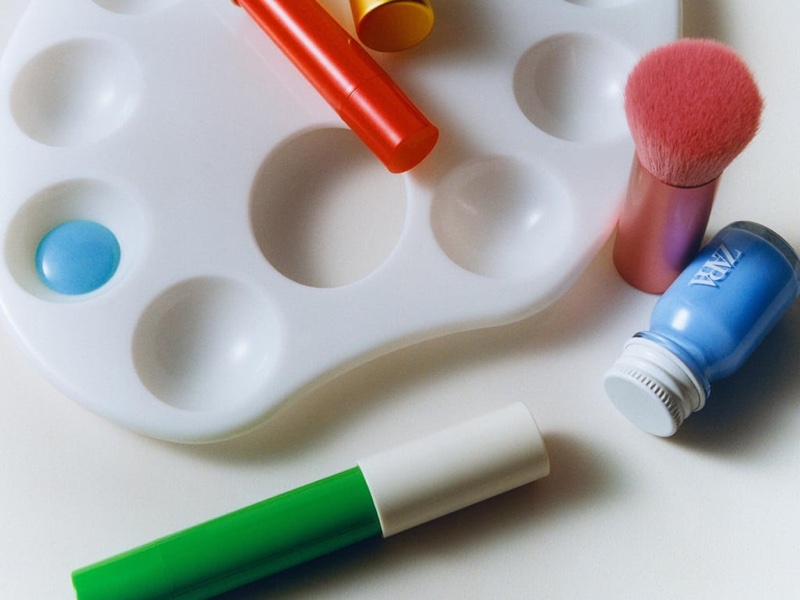
A dopamine hit for creative little ones, the Mini Artists make-up line from retailer Zara was created by MUA Diane Kendal, who channelled her own experiences as a mother to make the range. Water-based nail lacquers in six glitter and six matte colours can be used on the nails and body before being washed off, while face pencils come in eight colours. The range makes our list because of its art-inspired mixing palette, which encourages children to create their own colours.
4. Chanel, N°1 De Chanel Rich Revitalizing Cream
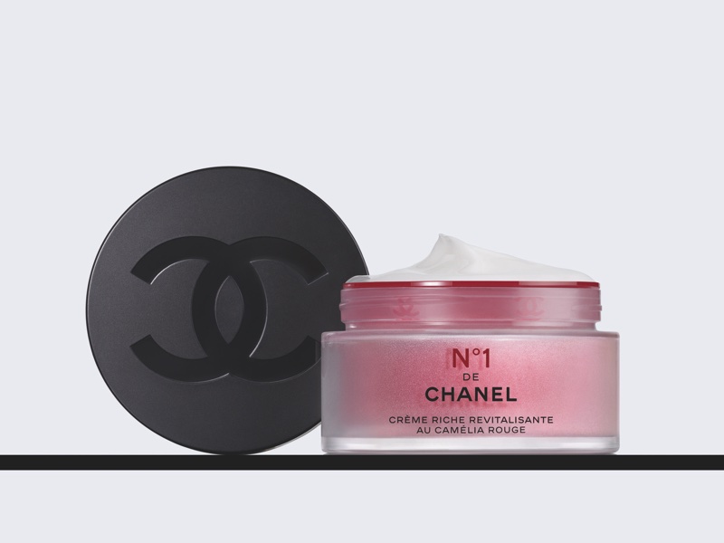
At first look, the packaging for Chanel’s January launch is just another cream jar: classy and luxurious, yes, but nothing out of the ordinary. But Chanel has been on a comprehensive sustainability journey when it comes to packaging. The weight of the jars and bottles in its N°1 De Chanel range have been reduced; 80% of the products in the range are made of glass; and the new cream jar is refillable. Across N°1 De Chanel, paper leaflets have been removed, the use of plastics limited and the lids contain recycled or bio-sourced materials.
5. Vacation, Classic Whip SPF 30
Classic Whip SPF 30 from sun care start-up Vacation has been the viral sun product of 2022 and 2023. The nostalgic, 1980s-inspired packaging dispenses a whipped cream-looking product, ready to be slathered on the skin. But there is more than just good marketing behind the decision to have some fun with sunscreen packaging. Vacation founding partner Lach Hall told Cosmetic Business: “We believe people are now on-board with the importance of wearing sunscreen, and that the best way to encourage them to actually wear it every day is through fun, sensorial products that are actually enjoyable to use.”
6. Prada, Paradoxe
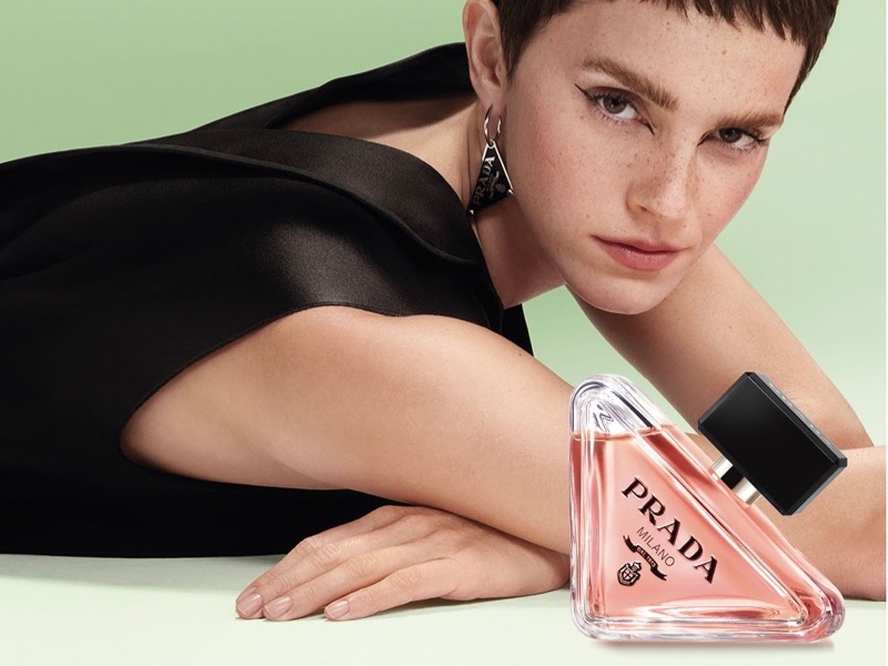
Paradoxe is the first refillable fragrance by Prada. The eau de parfum comes in bottles of three sizes, all refillable and said to be ‘made to last’. For a more sustainable impact and to allow for less packaging material, the bottle has also been designed to limit its weight and use of glass. YouTube videos by Prada guide the user through the refill process; the bottle’s distinctive triangular shape, for example, means it can’t be popped on a flat surface for refill, but can be balanced between the ring finger and little finger while the reduced-packaging refill decants the fragrance.
7. Lancôme, HAPTA
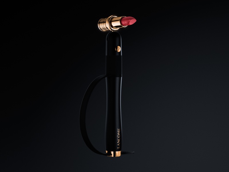
Not packaging, per se, but certainly a leap forward in beauty design is HAPTA from L’Oréal’s Lancôme brand. A hand-held, computerised make-up applicator – initially launching for lipstick – HAPTA has been developed to advance the needs of people with limited hand and arm mobility. It incorporates technology created to stabilise and level eating utensils, to provide a precision of application that can otherwise be hard to achieve. HAPTA’s magnetic attachment allows for 360-degree rotation and 180-degree flexion, while sensors work to both level the device and compensate for any up-and-down motion.
8. Lush, Super Mario Bros.
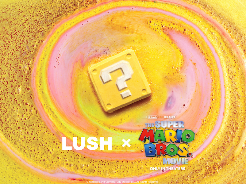
Who says you need a pack to pull off the perfect design? In April, Lush teamed up with Nintendo for a Super Mario Bros.-themed collection, tapping into hype surrounding the launch of The Super Mario Bros. Movie. As part of the line-up, Lush unveiled an industry first: the first bath bomb (its Question Block bath bomb) featuring a collectable soap hidden inside. The six power-up soaps each had their own unique fragrance and colour, and included the game’s iconic mushrooms and elusive gold star.
- Companies:
-
Procter and Gamble
-
Isamaya Beauty
See more
