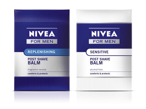
Design group Pearlfisher has redesigned the packaging of Beiersdorf’s Nivea for Men face care for a global relaunch. Jonathan Ford, creative partner, Pearlfisher, said: “We have modernized and brought the range together by streamlining the packaging colours. Silver, blue and white are the dominant colours with different colour-coded focal points featured in the centre of the packaging to help male consumers distinguish between sub-ranges and navigate in-store.”
The relaunch is said to underline the broad competence of the brand and reflect Beiersdorf’s extensive expertise in male grooming, acquired through numerous national and international studies on behalf of the Nivea for Men brand regarding consumers’ true needs.


