
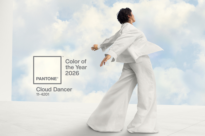
Pantone has revealed its colour of the year 2026 and it has divided opinions across social media, with some calling it clinical rather than comforting.
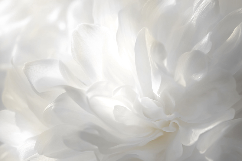
The colour authority has chosen white hue Cloud Dancer, also known as Pantone 17-1230, as its 2026 colour, describing it as a “symbol of calming influence in a frenetic society”.
“Similar to a blank canvas, Cloud Dancer signifies our desire for a fresh start,” said Pantone in a statement.
“Peeling away layers of outmoded thinking, we open the door to new approaches.
“Cloud Dancer quiets the mind, encouraging true relaxation and focus that allows the mind to wander and creativity to breathe, making room for innovation.”
Pantone claimed its selection of the colour was “not an arbitrary decision”, and that the selection process “entails thoughtful consideration and trend analysis”.
However, in a similar scenario to the reveal of Pantone’s ‘Mocha Mouse’ as its colour of choice for 2025, social media users immediately expressed their disappointment in the choice of 2026’s white hue Cloud Dancer.
Lidiana Rios (@ittybittylidi) commented on Instagram: “The colour of millions of boring ‘influencer’ interiors that interesting and curious design is actively moving away from… did you ask AI to come up with this?
“It is giving LLM-generated, it’s an algorithmic choice, it’s almost radically uninspired, I could pass out from boredom.”
Another Instagram user, referring to themselves only as Jasmine (@jasminegtylr), said: “Moving from Mocha Mousse to a white (however [you] dress it up) is just a bad move because naturally, after a year with a neutral, [people] are gonna want something more vibrant.
“Culturally, we are shifting back into vibrance and colour, so Pantone becomes behind the zeitgeist and therefore is not culturally relevant for a whole year 💀 who let [you all] choose white.”
An Instagram user going by Maxim (@maxim_dq), said: “As in 50 shades of white supremacism?", while another person, Juliana Tozzi Almeida (@julianatozzialmeida), added: “It is not even a colour. It is an empty box.”
Other social media users have looked more favourably on the colour choice, as Angie May Jones (@angie.may.jones) commented on Instagram: “Well I love it. No hate here. I think it is honestly perfect.”
Another Instagram user, Brittany Merola (@brittanymerola), commented: “In perfect timing with the new moon and the ending of a nine-year supermoon cycle.
“The colour is a perfect choice for new beginnings.”
Explained: The real reason Pantone chose white colour Cloud Dancer
The colour choice, according to Pantone, serves as a tonic to the busyness of modern-day life.
In the company’s webinar revealing the colour, which took place on 4 December, the colour authority claimed people are increasingly seeking “respite and relief from emotional and physical stimulation” amid a “cacophony of noise and conflicting messages”.
Pantone said its choice for the “lofty” white, “reads like a breath of fresh air” and as “a symbol of calming influence in a frenetic society”.
Leatrice Eiseman, Executive Director of the Pantone Color Institute, said: “At this time of transformation, when we are reimagining our future and our place in the world, Cloud Dancer is a discrete white hue offering a promise of clarity.


