Often an unsung hero of retail, the label is often the first opportunity to impress, and as a result, can be an enormous driver in commercial success. Like packaging, labels are a key part of the overall purchase experience. It’s a chance to showcase brand identity and make a strong value proposition in the blink of an eye. This becomes even more pronounced in omnichannel retail, where first impressions are everything.
Of course, it can feel like label design is pulling in many different directions. Some brands are favouring chic minimalism, while others aim for vibrancy and true visual punch. What is consistent from one product category to another, however, is the need for brands to make their label designs work harder – particularly when it’s such a strong driver for retail performance.
So how are today’s savvy label designers adding greater value and creating a more enticing proposition for consumers?
Stand-out designs
An aspect that is making a big comeback on a brand's agenda, are tactile finishes that engage with a consumer’s innate desire for a pleasant textural touch and sensory feel.
Consumers are focusing on how a product feels, and it plays an important role with an end-user's perception of the product. Designers can add more depth and dimension to labels through tactile finishes such as metallic hot and cold foiling, combinations of matte and gloss finishes or even raised and lowered elements – creating a premium look and feel.
A touch of luxury with the ‘everyday’
One of the most effective ways to make label design work harder is with premiumisation. Naturally, we assign more value to those products we believe are more luxurious or high-class. Labels are a fantastic vehicle for driving this message home!
It’s all about taking the more every day, almost mundane product categories, and turning the product into something that feels special
A common misconception, even today, is that it’s difficult to make label design premium, or it’s a large cost to the brand. The fact is that today, it can be made extremely simple – and effective. It’s all about taking the more every day, almost mundane product categories, and turning the product into something that feels special.
Tactile finishes that engage the senses, including decadent matt lacquers or metallic foiling that glistens and looks incredible on-shelf, are just two examples of where this can be easily integrated into label designs.
Colourful
In retaining their competitive edge, brand owners should be implementing the latest colour trends to create stylish designs. Designers can employ colours like Pantone's 2022 Colour of the Year, Very Peri, a new red-violet infused blue hue, other trending colours for 2022 include greens, moody blues, or even warm natural and neutral colours that symbolise calm and serenity.
On the flip side, brands wanting to be bold can also adopt acid greens, yellows, pinks, and oranges, which are also popular colours this year as consumers seek sources of joy and contentment.

Clean labels
Another key trend is trust, which is becoming an important issue when establishing brand loyalty. The end-user wants detailed reports of the ingredients and exact formulations to ensure that products are safe for them to use in the long term.
Consumers are also demanding concise and correct labelling information about ingredients and expect greater transparency from brands and retailers. More and more consumers want to know where the ingredients are sourced and how the products are manufactured before committing to purchasing the products.
Coupled to this are end-users questioning the sustainability credentials of their favourite products as consumers are becoming more eco-friendly and environmentally aware.
Sustainability
Sustainability is, and will continue to be, one of the driving forces behind consumer engagement. Those brands looking for sustainable labels would typically require labels that incorporate face stocks and liners up to 50% thinner than comparable constructions and use less oil, water, and energy during production than conventional label materials.
In reducing a product’s carbon footprint across the supply chain, brand owners are also looking for label solutions that incorporate renewable alternatives to traditional fossil fuel-based films, including mineral-based materials, fruit pulp paper, and products such as Bagasse and OPM’s Cleanflake.
More with less
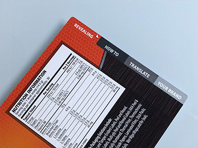
The biggest trend by far is doing more with less. This is especially pertinent where regulatory requirements and clarity are key considerations. A big turn-off for consumers is labels that look crowded and busy, and this is one trend where we have kept a close eye on during the development of our Multi Dex label design.
The Multi Dex label is an overhaul of the peel and reseal design, which comprises a multi-layered, multi-indexed, multi-substrate and multi-coloured label design which is ideal for incorporating detailed information across a smaller footprint. The label makes the ‘real estate’ work harder and is a new way for brands to use label space more effectively.
In conjunction with changing trends, the technology behind labels is evolving, enabling brands to connect effectively with consumers. Multi Dex is one example of this positive shift in new labelling techniques. It is going to be exciting watching how brands adapt to the changing retail market and even more exciting for those at the forefront of developing innovative packaging and labelling solutions designed to drive true value for brand owners.
Making labels a central part of the experience
Of course, we know that a label does more than simply convey information. It is an integral part of the packaging design and when done right, it can uplift a product at any price point and turn a purchase into an experience.
There’s no doubt brands are under pressure in a changing retail landscape, and label design is one area where there has been real focus, and when there’s commercial performance tied to their effectiveness, that’s for good reason.
At OPM Group, we believe label excellence should be accessible for every brand and not only that – it should be simple to achieve. It’s this thinking that guides our product development, including the trailblazing Multi Dex design.
With an extra dimension available in the form of multi-layered, multi-indexed, multi-substrate and multi-coloured peel and read labels, the precious label marketing real estate works harder without overwhelming designs.
To learn more about OPM Group, its products and accreditations, please visit opmgroup.co.uk

