The range of colour cosmetics is huge. Online shops and the shelves of retailers all over the world are filled with inventive shade names and a variety of finishes leave almost nothing to be desired.
Consumers are spoilt for choices to find the perfect product for their looks. And while finding the right shade is one side of the story (oh yes!), there is this "first sight“ impression we have from a colourful product, that impacts the try-and-buy decision.
Depending on the consumers' first touch point with the product, they will either see a digital swatch online, a printed colour dot on the shelf, or a packaging, which represents the actual product shade.
Or they are in front of the shelf and see an inspiring bulk colour that grabs their attention. Seconds later the actual product application can be surprising … Surprisingly different.
There are basically three factors that influence the colour of a cosmetics product: colour, appearance and coverage. The colour impression can be significantly influenced by appearance factors.
For instance, there is this nice greenish pressed powder eyeshadow which reveals colour-changing particles once it is applied and the light can be reflected from different angles on the skin.
Or this vivid orange lipstick bulk which turns out to be low in coverage and therefore interacts with the natural lip colour, leading to a beautiful but different shade.
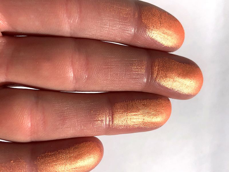
We also found this nice chromatic blush, which we examined and photographed in detail for this article. Do you see the range of colours the product reveals, depending on the angle and the intensity of coverage?
It is interesting to see what happens, when the product is applied on the skin and flat surfaces vs. this nice fluffy cotton pad, where the reflection/absorption reveals a different colour impression.
The overall question is: What is the "real“ colour of the product? How can a consumer be more certain about what colour to expect? Our brain is processing a lot while assessing the appearance of a colourful product in real life.
How can this be covered technically with regard to standardized colour measurements? And equally for a variety of product types such as powders, creams, liquids, pens?
To reduce all colour and appearance factors down to one single colour value to be communicated on all possible consumers touch points is challenging.
We love this challenge! The goal for LIFE IS COLORFUL is to simulate the human eye and the processing power of the human brain when referencing the colour of a product and to get the most realistic, accurate, and reproducible colour value for colour communication.